Deeper with Threads

Posted by Brandon Lackey on Mar 16, 2015 3:40:00 PM


At ExhibitorLive! 2015 we showed our newest product introduction, Threads™!

It was a great opportunity to show other industry professionals how versatile Threads™ can be, and how much design freedom one can have with each Threads™ element. The show was a success, and it was so much fun showing people our new innovative portable exhibit system!


The concept of Threads™ is simple:

An ultra-lightweight, easy-to-assemble frame with a 360º seamless graphic.


The frames are built with thumb screws, and graphics are attached with Velcro® and a zipper. Elements can be positioned where, when and how YOU want them, giving you true design freedom. Threads™ eliminates the design limitaitons imposed by conventional, fixed-configuration displays.
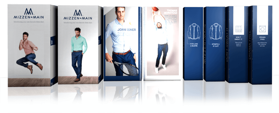
 

Also, elements can be arranged so that your message is viewable from any angle, increasing the time you are seen by visitors. These elements can also be rotated instantly during a presentation. You can show attention-grabbing visuals on one side and techinical data on the other.

See for yourself why assembling Threads™ is as easy as a zipper:


For more information about Threads™, go to:

www.old.expodisplays.com/threads


Pantone: Spring 2015

Posted by Georgie Allen on Mar 17, 2015 11:19:00 AM

What color is your happy place?

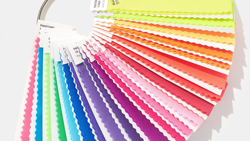
Pantone® has come out with its color pallete for this spring season, and there is a move toward the cooler and softer side of the color spectrum. A mix of colorful brights, pale pastels and nature-like neutrals.

The soft cool hues, blended with subtle warm tones creates a soothing escape from the everyday hustle and bustle.

For me personally, I am in love with the Scuba Blue®. This is a bold but subtle color, and gives a refreshing tropical feel. Glacier Gray® and  Titanium®  are also among my favorites this season. They blend well with both softer and bright color hues.


Color of the year:


Marsala®: Pantone’s pick for this year, this is the big one. Marsala is a timeless shade of red with distinct brown undertones, and was something of a surprise this year. Classy pick, Pantone®!

Marsala for Graphic Design

A rich contrasting color, Marsala is ideal for use in graphic design and packaging. Eye-catching, but not overwhelming or bright, consumers are immediately drawn to the hue, making it an alluring shade at point-of-purchase. As packaging becomes increasingly more artistic, Marsala will be a natural fit for both high- and low-tech materials, including on-shelf periodicals as well as printed assets, like calendars and stationery.

What do you think about Pantone’s color pallet for Spring 2015?  What is your favorite color for 2015?

Let us know what you think below!


Rebranding Your Booth

Posted by Brandon Lackey on May 1, 2015 1:06:00 PM

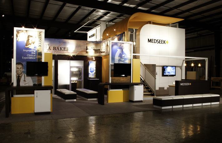
When our longtime ExpoDisplays customer MEDSEEK announced a name change, their custom trade show display was on our mind. This Birmingham-based company name sported a strong logo with an energetic orange color that truly gave their company a strong image.

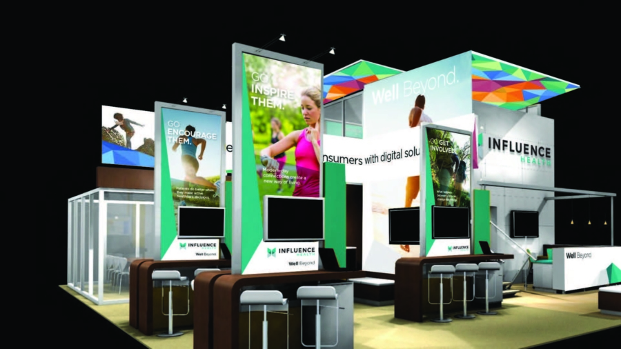
The new name, “Influence Health”, is meant to reflect their ongoing success in delivering healthcare’s only integrated digital consumer engagement and activation platform. The new Influence Health logo and colors consists of cool and clean colors, resulting in a clean and trusted company image.


Now here’s a look into how we transformed their custom display to fit their new branding:

 BEFORE


And now, the AFTER


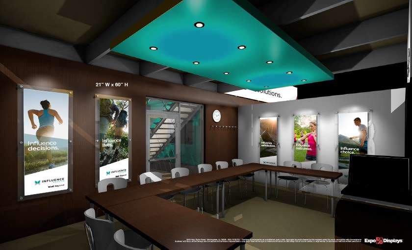
WOW!  Big change, right?  Here’s a look at the conference room.


Whether you invested in a massive custom exhibit such as this one or you do a small few shows every year, you know the importance of tracking.   Download this easy sheet as another tool to measure your performance.