Pantone: Spring 2015
Georgie Allen on Mar 17, 2015 11:19:00 AM
What color is your happy place?
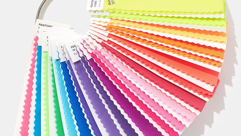
Pantone® has come out with its color pallete for this spring season, and there is a move toward the cooler and softer side of the color spectrum. A mix of colorful brights, pale pastels and nature-like neutrals.
The soft cool hues, blended with subtle warm tones creates a soothing escape from the everyday hustle and bustle.
For me personally, I am in love with the Scuba Blue®. This is a bold but subtle color, and gives a refreshing tropical feel. Glacier Gray® and Titanium® are also among my favorites this season. They blend well with both softer and bright color hues.
Color of the year:
Marsala®: Pantone’s pick for this year, this is the big one. Marsala is a timeless shade of red with distinct brown undertones, and was something of a surprise this year. Classy pick, Pantone®!
Marsala for Graphic Design
A rich contrasting color, Marsala is ideal for use in graphic design and packaging. Eye-catching, but not overwhelming or bright, consumers are immediately drawn to the hue, making it an alluring shade at point-of-purchase. As packaging becomes increasingly more artistic, Marsala will be a natural fit for both high- and low-tech materials, including on-shelf periodicals as well as printed assets, like calendars and stationery.
What do you think about Pantone’s color pallet for Spring 2015? What is your favorite color for 2015?
Let us know what you think below!